
Finished charcoal drawing self portrait. Bigger warped features of the "ideal" asian face in Asia. Made my face match those standards to portray unrealistic body image in Asia.
This artwork is a self portrait of me. The title of the piece is called Standards, and it conveys the problem of body image. This piece has charcoal and white charcoal in it . The goal of this was to make it a "idealized" version of me, in my country, describing whats beautiful in society today. Overall, I think this piece shows how to incorporate a story in your art.
Questions:
1. I tried the highlighting technique with the white charcoal. I feel like I didn't really master the technique but if I studied light more maybe I could improve.
2. I followed my favorite artist Yang Se Eun, or Zipcy, Her art is so beautiful and I try to make my art have more meaning like she does.
3. I do think that this portrait is ok, but it is definitely not something I'm truly proud of. I think if I connected to the prompt more I could've done better.
4. I would take my time and understand what I actually look like and not try to draw something that I'm not. I want to understand natural human features better, and become accustomed to the human face and not the basic drawing of one.
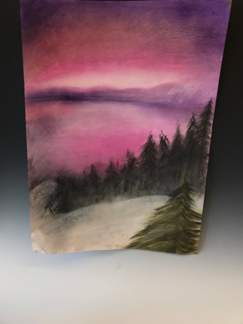
This is my landscape drawing for this unit. It is inpired by Bob Ross's wistful and fantasy images of landscapes. It has soft pinks and white blended into eachother to create a dreamy effect, and it has bold purple in the background, and some jade green on the subject of focus, the pine tree. It is like the sun just went down and the hour is evening. For this art, I used chalk pastel, pencil and a reference from Google.com. I used blending and texture techniques with the pastels. The idea behind this art and the color choice in La Vie En Rose, or life in pink as I feel this picture portrays. My goal mostly was to capture the soft midground and background of the pink and purple and white and peach all swirled together into a beautiful sunset. Overall, I feel ok about this work and would give it a decent grade. It shows a story and emotion, which is the mossst important thing, to make people feel something when they see a piece of art.
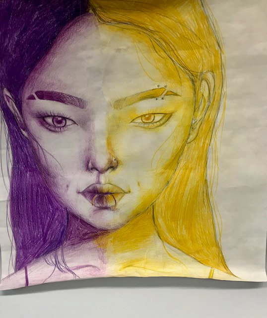
This is my complimentary color project. I used the colors purple and yellow because they remind me of lemons and blueberries, which go really well together. I used colored pencil and graphite pencil to sketch it out. I used layering techniques and pencil pressure techniques to create a soft feeling in the features and a harsher feeling around the face, like the hair for example. I put piercings on the yellow side to show toughness, sourness like a lemon and no piercings on the purple side to show the sweetness of a blueberry, but then still added the lip piercings on both sides to show that a lemon isn't always bitter and a blueberry isn't always sweet. Overall I worked really hard on the shading of this project, though I am not happy with the proportions of the girl, I should have paid more attention to how a face is structured, the same mistake I made in the first charcoal portrait drawing. Hopefully I get a good grade
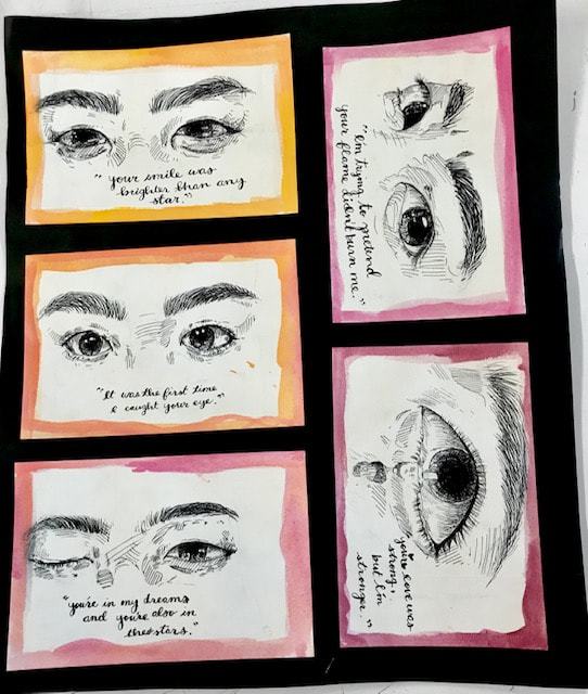
This is my Eyes project. My medium is ink and watercolor on watercolor paper. For this project I was trying to convey a story in a series of pictures. Under each picture there is a quote that corresponds with the one following it. It conveys a love story but not one that ends in heartbreak, but ends in a better understanding of oneself. Through each of the pictures I use cross hatching, stippling, and regular linework with a thin tipped pen, and then lined the edges of each paper 3 times with watercolor, each lighter or darker than the last. I used a sort of sunset beach theme because who doesn't like sunset beach colors? I also used pen for the quotes under my eye drawings. I feel like I did well on this project as pen is really hard to work with like shading. I do feel like I could've spent a little longer time on making the quotes less messy and thinking more on what I should write. Overall I do like this piece better than the rest and it reminds me of life and what every teenager at some point experiences.
This is my zentangle/pattern project.
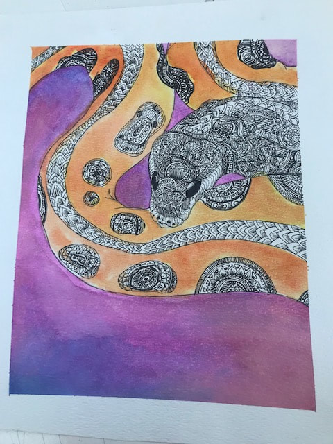
The medium for this project was Micron Pen 02 and 03, as well as watercolor and graphite pencil. I chose to draw a snake as my balance between peace and chaos. The stigma around reptiles and snakes is really sad considering that they are amazing creatures. I chose to put the chaos in the snake, but also leave some peaceful orangey touches to make the snake balanced, that even if something looks scary, there is still some peace left to find. I used a wash method to blend the watercolor and stipling for the snakes eyes and some crosshatching along the head of the snake. I really like this project, as well as the color choices. I do think I could have done some more line variation in the project but overall I am happy with it. It is my idea of chaos and peace.
Creating the WHY: Tempura Batik
1. The idea of painting three layers of paint to create a resistance to the ink relates to life in a strong way. It creates the idea that we build up these emotional walls over time, whether those walls be good or bad, they protect us from experiencing something that we don't like. for example, relationships. If in a constant cycle of bad relationships, that person begins to build walls so they don't get hurt again by people.
2. Painting the image over with black relates to life because everyone goes through some sort of a hard time. A person has their darker, bad days. I struggled in middle school with anxiety and depression, and I still do, but those were the dark days, it washes over your true self like a wave of sick.
3. Washing off the black relates to life because no matter what we can always rise from the hardship we go through. For example, someone who has been hurt and abused closes their heart from people, but with enough kindness and support, that person is able to open up again. Yes, there still is a little darkness left behind, because experiences can be scarring, just like the effect on tempura batik. But even through those streaks you can still see the colorful you.
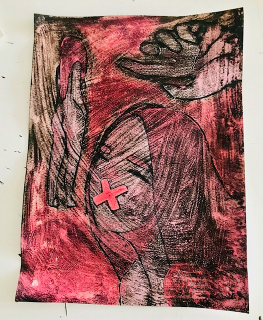
Tempura Batik Project
For this project I used three layers of tempura paint, as well as sharpie and black ink as a finish. This piece conveys a girl who is trapped in some sort of surreal life. I wanted to go for this effect because I wanted people to understand that embracing that odd surreal side is beautiful. The big pink X in the front of the girl's mouth is showing how mental illness can make you lose your voice and yourself, but the colors of soft pinks were to show how people glorify and soften these illnesses to "aesthetic." I used small brushes and blending techniques to create the color shifts, and I painted the brush of ink erratically to show the madness in the mind. I do like this project and I am happy that I went a little bold with it. The colors are nice and I like the shape of the girl's body that I painted. One thing that I wish didn't happen was the excessive streaks of black ink left. But I decided just to embrace it and understand that maybe there's a little more sad left in some minds but that is ok since the color still shines through. Overall I am happy with the project but I do wish the streaks of black were less prominent.
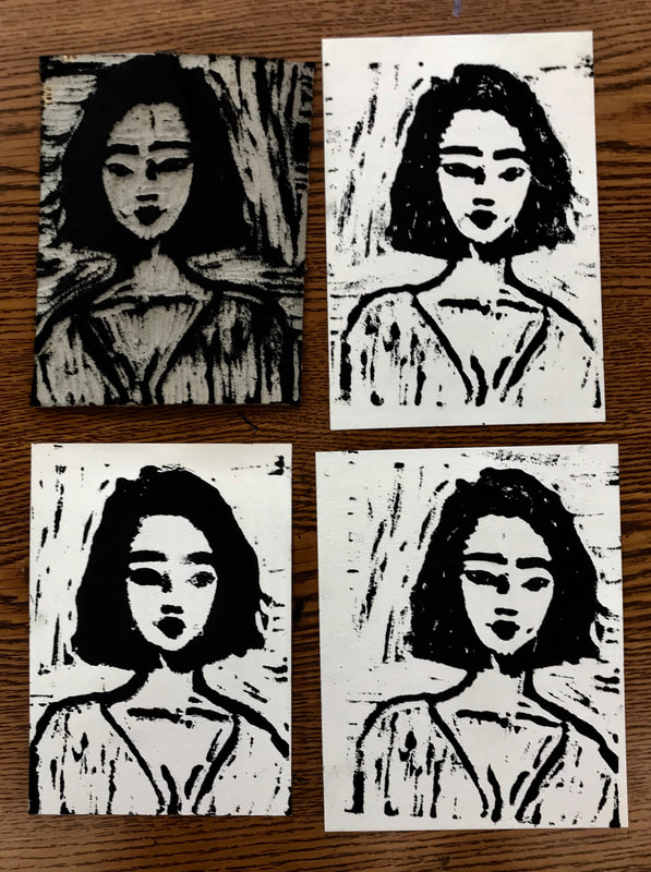
Soft Bois
For the printmaking project I used black printing ink, as well as a linoleum square to carve into to make the print. For this project I wanted to create something really simple and feminine, gentle features of a woman. Every feature is simple and soft yet it is still bold. I used different blade sizes to carve smaller details. and I really worked the ink into the cracks to get texture on the background. There weren't any specific techniques I used except the scooping method to make sure not to cut too deep into the linoleum. I would most likely change the entire design for this piece as I'm not really that happy with it, since I'm indecisive. I do think however the softness of the womans features were captured well in the face. I do think it is a worthy project, I am just not as proud of it as other projects I have done.
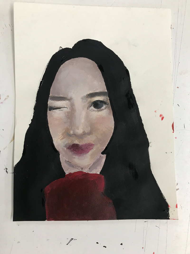
Not Me
For this project, I used acrylic paint and graphite pencil. The final project shows me but not me, my features fuzzy blurred and distorted. I did not paint the background because I wanted to show that the missing piece for me was my community, the world that surrounded me, not who I was. This is mainly connected to adoption, and how I will always be missing a piece of my birthcountry and culture. I used a dry brush to get the fuzzy effect. I did mess up on the proportions and shading however, I decided it could be a happy accident and made a real story out of it. I do like this project, but I am more impressed with work I have done earlier in the year.
